Thomas Stafford
John Young
Eugene Cernan
Allen Stevens

The Apollo 10 patch was based more on the mechanics and goals of the mission than the philosophy of the space program or the astronauts flying this mission ... The patch was basically designed by the crew, primarily Young and Cernan, with a great deal of help from the artists at North American Rockwell.
—Gene Cernan, from All We Did Was Fly to the Moon
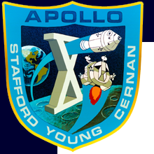
Stafford and Cernan flew together on Gemini 9A, and the patch for that flight is strikingly similar to this one: both patches are in the shape of a shield, and the dominant design elements are the spacecraft and the mission objectives, with the mission number of the flight represented as a large Roman numeral in the middle of the design. In the case of the Apollo 10 patch, the word “Apollo” and the crew names were added; except for that, the verbal description applies to both patches.
For the final time, North American Rockwell artist Allen Stevens did the artwork. All of his patches are distinctive and unique, but he used some elements repeatedly: except for Apollo 1, all his patches used Microgramma Bold for the lettering; the borders all were rough-hewn rather than smooth; and backgrounds were always "mottled." All his designs depicted the spacecraft — though this time he depicted the LM more accurately than on the Apollo 9 patch.
[ap10-aw2]
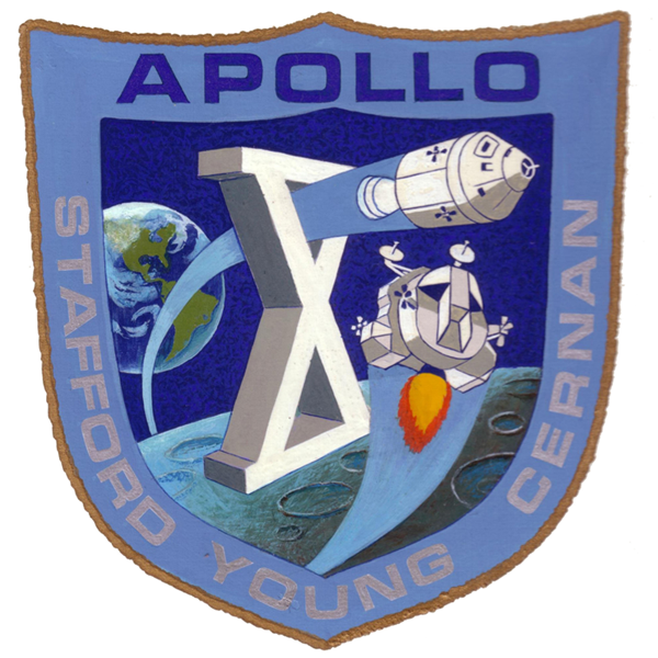
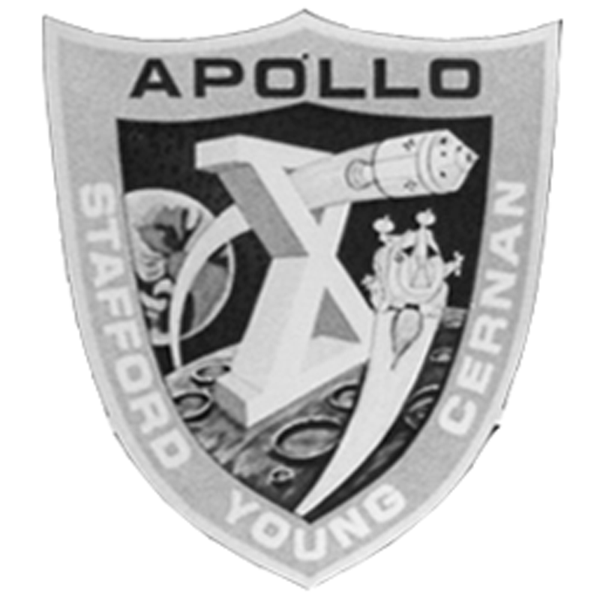
Allen Stevens’ original artwork. The crew names are gray, making them
difficult to discern.
[ap10-aw1]
NASA photo S69-31959
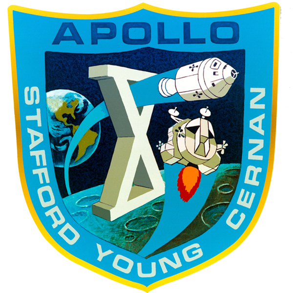
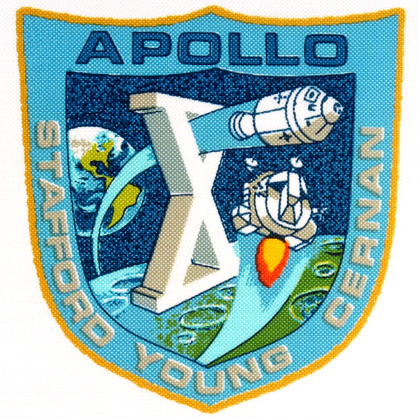
This rework of Stevens artwork by Norman Tiller retains virtually all of the
details — including the “mottled” space background — but brightens
most of the colors.
[ap10-aw3]
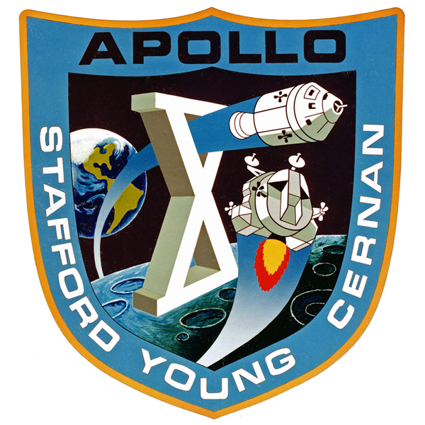
This second rework tones down the brightness of the colors used in
ap10-aw1, making them
more like Stevens’ original, but increases the contrast, especially for the
lettering — APOLLO is now black, and the crew names are now white.
This version also eliminates the “mottled” appearance of the space
background, and makes subtle changes to the shapes, and introduces gradients
into the contrails — which is a problem for silk-screening and embroidery,
but nice for print.
[ap10-aw4]
As with Apollo 9, the KSC art department created a version of the patch
that deviated considerably from the original. All the other versions hewed
pretty closely to Stevens original artwork, but this one is so obviously
at odds with it, that it is comical.
[ap10-bc1]
Beta cloth version of the Apollo 10 patch. This is clearly based on the
second-generation ap10-aw1, even retaining the gray crew names. Like
the Apollo 7 Beta cloth patch, (but unlike Apollo 9) this retains the
“mottled” space background of the original.
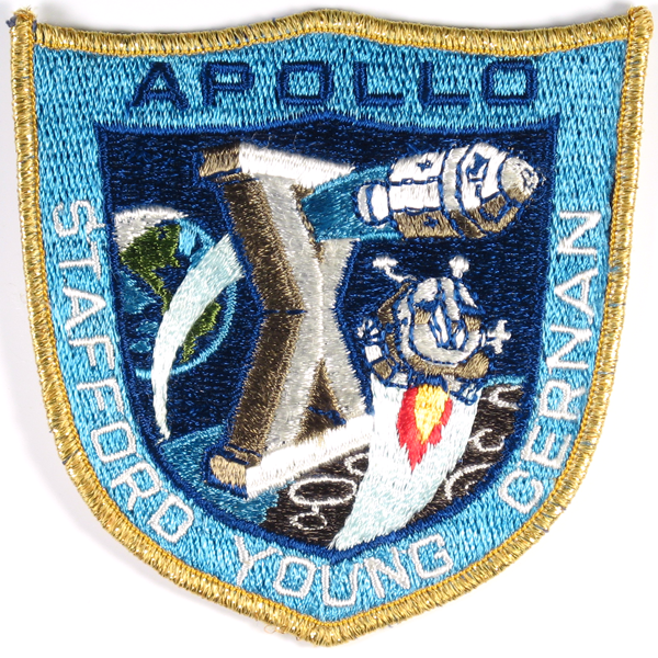
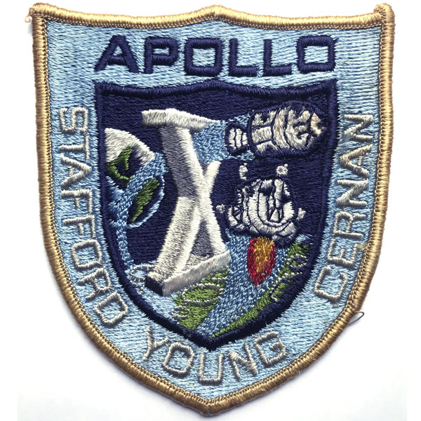
[ap10-em1]
This embroidered patch is the version the crew wore for
their “formal” portrait (see detail below). It
was supplied to the crew by Grumman, the builder of the
LM. The LM ascent stage is tilted back compared to the artwork.
104mm w × 104mm h
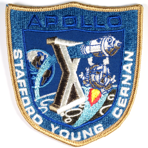
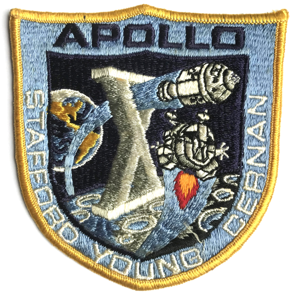
[ap10-em2]
The Lion Brothers embroidered Apollo 10 patch differs markedly
from ap10-em1, though it follows the artwork
more closely (note the attitude and shape of the LM ascent
stage, for example).
99mm w × 103mm h
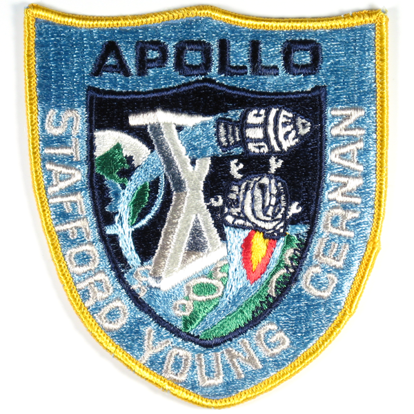
[ap10-em3]
Texas Art Embroidery version. Matches the
artwork ap10-aw1 very nicely, probably the best of the embroidered
versions.
100mm w × 104mm h
[ap10-em5]
According to Chris Spain, this is probably by Universal Commemorative.
The original artwork is only very slightly taller than wide; this
patch is noticeably taller than wide. The lettering used for the crew names is Eurostile
rather than Microgramma Bold. The CSM is crudely rendered.
97mm w × 110mm h
[ap10-em4]
AB Emblem version of the Apollo 10 patch. The
shape of the shield is more triangular than the artwork,
and the lettering used for the crew names is Eurostile
rather than Microgramma Bold as in the artwork. Both
spacecraft are crudely rendered.
99mm w × 110mm h

Concept art by Al Stevens for the Apollo 10 patch. Stevens repeatedly tried to break out of the classic circular shape, but the interior elements he used kept reverting to fairly literal images. My thanks to Noah Bradley for these two images.

Pentagon, hexagon — the problem with these shapes is that they simply didn’t relate to the mission in any way. A hexagon worked for Gemini 6 (and a triangle would be used for Skylab 3); but there was no relating “5” or “6” to Apollo 10. The interior elements on this version seemed to work though, so they made it into the eventual final design.
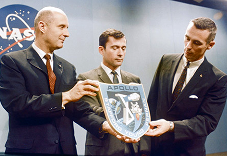
The Apollo 10 crew showing off their patch at a press conference.

NASA photo S69-34385
Portrait of the Apollo 10 crew.

This detail from the crew photo S69-34385 shows that, like the Apollo 9 crew, the Apollo 10 crew wore embroidered patches (almost certainly ap10-em1) for their formal portrait.

