
David Scott
Alfred Worden
James Irwin
Emilio Pucci
Jerry Elmore

The mission patch for Apollo 15 was basically designed by the Italian dress designer, Emilio Pucci. We had as a crew evaluated some 540 different designs for our crew patch. They appeared either too mechanical or to have nothing to do with the flight, so finally, through a mutual friend, we asked Pucci if he would help us with the design. Now, Pucci, as I best recall, was an aeronautical engineer [in fact, he was a bomber pilot in the Italian Air Force -ed] and had a good feeling for flight. With his artistic nature, we felt that he would be very helpful in the patch design. He did send us a design which was basically the same as the patch we eventually used, however the colors were in the normal Pucci blues, purples, and greens. We took his design, changed it from a square to a circular patch, made it red, white and blue, and put a lunar background behind the three stylized birds that were the major Pucci contribution. The symbology is of three stylized birds flying over the lunar surface, each indicating one of us who were on the flight. The lunar surface behind the patch shows the landing site (next to Hadley Rille at the foot of the Appenine Mountains) and directly behind the stylized birds is a crater formation that spells “15” in Roman numerals. You can also see from the stylized birds that they fly in formation with one on top and two closer to the lunar surface, indicating those who actually landed.
—Al Worden, from All We Did Was Fly to the Moon
In a letter from Pucci to Dave Scott, we get some insight into the state of the design when Pucci finished his involvement:
I am very happy to hear that the design I made for the emblem, which visually represents, and now I may say it, you, Worden and Irwin in the shape of three fast moving elements in space in the form of a capsule closely flying in formation to indicate the common goal and purpose of your flight, has met with your liking.
According to your indications I am sending three sketches in the size you indicated, using different backgrounds and lettering.
Sketch “A” is done on a solid black background. Sketch “B” is done with a grey and white background, representing the proposed lunar landing site. Sketch “C” is done in black and grey, that is, using no colors, to be reproduced in any color you like on stationary, etc.
You will note that the lettering of your names and of Apollo have been designed in a rush and are far from perfect. Please have them perfected by lettering specialists.
If it can be executed properly I think that sketch “B” is the best.
The blue and red which I have used are not exactly the ones of the American flag since I do not have the precise shades of color, but the emblem would be finally made in the true colors of the flag.
As you may have noticed I have signed my name “Emilio” on all the sketches, in black on sketch “B” (the one I prefer), and in white on “A” and “C”, as I do on all the designs I make.
 Pucci design piracy was
apparently a problem, and in an attempt to prevent this, on the advice of a
lawyer he started including his name within his designs. His explanation of
why he used Emilio rather than Pucci: “It was
considered shameful for a Pucci to work.” A note from Dave Scott to
MSC Art Department supervisor Stanley Jacobsen, reads: “The
‘E’ to be included in the design is
formed thus,” with a series of samples following. The ‘E’
did not make it into the final artwork, but Chris Spain points out that it did
end up as an additional hallmark on the embroidered patches that were specially
produced for the crew. These patches can be identified by the gold or silver
thread used for the “XV” hallmark. The “E” hallmark is
above the “WO” in Worden’s name on the silver hallmarked version,
and above the “N” in Irwin’s name on the gold-hallmarked version.
Pucci design piracy was
apparently a problem, and in an attempt to prevent this, on the advice of a
lawyer he started including his name within his designs. His explanation of
why he used Emilio rather than Pucci: “It was
considered shameful for a Pucci to work.” A note from Dave Scott to
MSC Art Department supervisor Stanley Jacobsen, reads: “The
‘E’ to be included in the design is
formed thus,” with a series of samples following. The ‘E’
did not make it into the final artwork, but Chris Spain points out that it did
end up as an additional hallmark on the embroidered patches that were specially
produced for the crew. These patches can be identified by the gold or silver
thread used for the “XV” hallmark. The “E” hallmark is
above the “WO” in Worden’s name on the silver hallmarked version,
and above the “N” in Irwin’s name on the gold-hallmarked version.
Another written note from Scott to Jacobsen (from Still, p.181) illustrates some of the changes made toward the end of the design iterations:
We have a few modifications we would like to make to the final [design]:
1. Attached is a somewhat different scale photo for the surface at Hadley. In particular we have tried to include the unique characteristics of the Rille ...
2. We feel that the contrast is adequate to eliminate the white borders around the [vector] shapes and use only red, white, and blue over the landing site.
3. We also think the white border inside the inner red circle is unnecessary.
4. The phases of the moon for XV is well done; although I guess that representation for [Apollo] 15 is still questionable. One suggestion was to place that concept somewhere on the surface ...
 Jerry Elmore, a contract employee in the
MSC Graphics Arts Branch, executed the final artwork for the patch.
Considering the rough state of the design when Pucci handed it off, it’s
clear that Elmore contributed as much to the design as Pucci. The
“bird” or “capsule” shapes are much refined from
Pucci’s sketch; the expertly rendered lettering is a wonderful choice
to occupy the space between two concentric rings; and the lunar surface is
entirely the superb creation of Elmore. According to John Bisney, Elmore
claims he hid his own initials among the details of the lunar surface. While
Elmore never admitted it, my theory is that there are meanderings in the
rille that trace out the letters “J” and “E”. This is
the actual path of the rille, so Elmore could never have been faulted for
including his initials, a practice that was officially frowned upon.
Jerry Elmore, a contract employee in the
MSC Graphics Arts Branch, executed the final artwork for the patch.
Considering the rough state of the design when Pucci handed it off, it’s
clear that Elmore contributed as much to the design as Pucci. The
“bird” or “capsule” shapes are much refined from
Pucci’s sketch; the expertly rendered lettering is a wonderful choice
to occupy the space between two concentric rings; and the lunar surface is
entirely the superb creation of Elmore. According to John Bisney, Elmore
claims he hid his own initials among the details of the lunar surface. While
Elmore never admitted it, my theory is that there are meanderings in the
rille that trace out the letters “J” and “E”. This is
the actual path of the rille, so Elmore could never have been faulted for
including his initials, a practice that was officially frowned upon.
With respect to embroidered patches, Apollo 15 marks a watershed. Until Apollo 15, Lion Brothers seemed consistently to produce embroidered patches that were more faithful to the patch artwork than those of AB Emblem. This is particularly noticable in the Apollo 7, 10, 13 and 14 patches. Beginning with Apollo 15 roles were reversed, with AB Emblem making patches which were consistently more faithful than Lion Brothers. The one point on which the Lion Brothers patches seemed consistently at variance with the design was the size of the lettering. This is most noticable in the Apollo 15 and 17 patches.

[ap15-aw1]
NASA photo S71-30463
Artwork for the Apollo 15 patch by NASA contract artist Jerry Elmore.

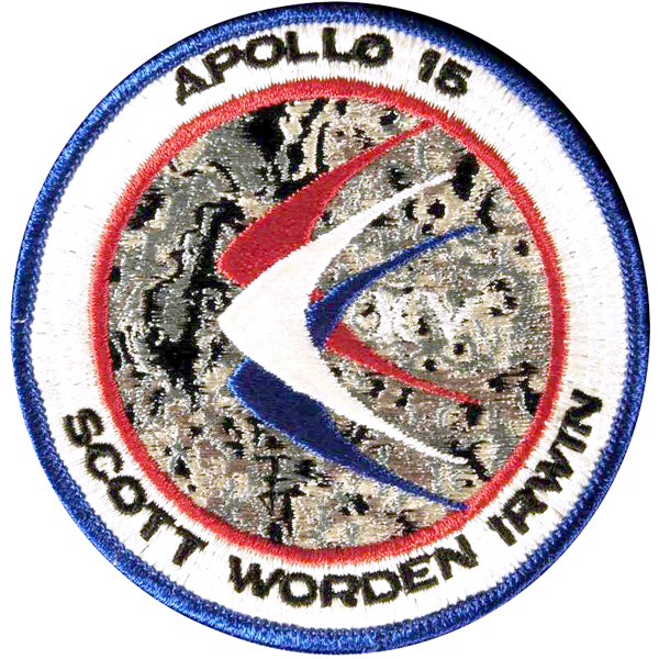
[ap15-em1]
AB Emblem embroidered Apollo 15 patch. This patch has the
“XV” hallmark designed into the patch. Up until Apollo 14,
Lion Brothers patches tended to follow the artwork more faithfully
than the AB Emblem patches. This tendency reverses beginning
with Apollo 15.
101mm w × 102mm h
[ap15-em2]
This Apollo 15 patch — manufactured by AB Emblem —
has the “XV” hallmark sewn
in silver. It was a special version made just for the crew,
but many have surfaced at auctions. There is another version
with the hallmark sewn in gold thread that is extremely rare.
My thanks to Bill Hunt for this image.
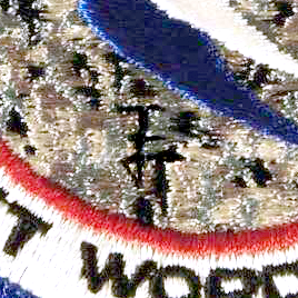
The silver-hallmarked patch has another “hidden” feature: the “E” (for Emilio) described by Dave Scott in a note to Stan Jacobsen.
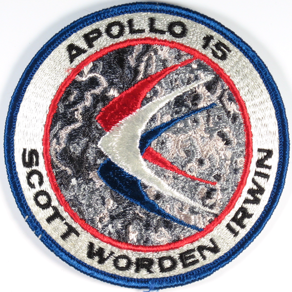
[ap15-em4]
The Lion Brothers embroidered Apollo 15 patch. The crater
outlines making up the “hallmark” are in white
here, instead of black, making it almost invisible. The standard
Lion Brothers hallmark (see next photo) is used instead.
The lettering is oversized on this patch, making the crew names
occupy nearly half the circumference.
101mm w × 102mm h
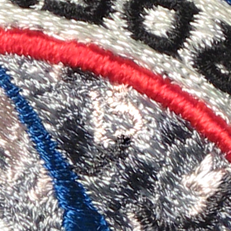
The Lion Brothers hallmark — the number “15” upside down near the “D” in Worden’s name.
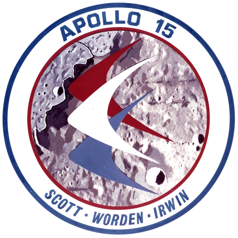
This early version of the patch differs from the final version in many respects, the most noticable of which are the lunar surface, which here is an extremely accurate depiction of the area (much more so than the eventual, final design); and the font, which was really perfected in the final design. My thanks to Mike Acs for this image from his Flickr photostream.
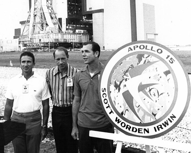
NASA photo KSC-71P-330
The Apollo 15 crew presented their
patch design during the rollout of their Saturn V.


