
Walter Schirra
Donn Eisele
Walter Cunningham
Walter Cunningham
Allen Stevens

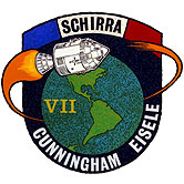
“The Apollo 7 design itself highlighted the earth orbital nature of the mission. It was our original intention to emphasize the first manned Apollo (Gus Grissom’s flight) and the recovery from the fire on the pad aspects as well. We considered a spacecraft rising from a ball of fire and calling it the Phoenix. The patch designed was subject to NASA approval and we abandoned the Phoenix theme feeling it would be rejected as in bad taste. I zeroed in on a circle (for the Earth) and an ellipse (for orbit). The orbital plane was tilted for artistic reasons.”
—Walt Cunningham, The All-American Boys
This patch, and all patches through ASTP were worn on the left breast.
The creator of this patch was unknown until May 2008, when Ed Hengeveld and Noah Bradley identified Allen Stevens of North American Rockwell as the artist. (Note that in September 1967 North American Aviation merged with Rockwell Manufacturing Company, and the resulting company was called North American Rockwell. This is the name I will use hereafter.)
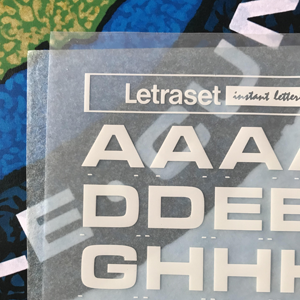 In the captions below, Microgramma and Eurostile refer
to fonts.
Microgramma
was created in 1952 by Aldo Novarese, contained only uppercase letters, and
existed only in “extended” form.
Eurostile
was designed in 1962 (also by Aldo Novarese) but contained both upper and lower case
letters, and existed in regular as well as extended form. There are subtle but
noticable differences between the two, particularly in the interior angles of
characters like A and M. Both Microgramma Bold and
Eurostile Extended Bold were available in rub-on form from
Letraset (a staple
of graphic artists of the time), but only Microgramma was available in white.
It is evident that rub-on lettering was used, partly because of the precision of
the lettering, but also because the “mottling” of the background
bleeds through the lettering in the artwork.
In the captions below, Microgramma and Eurostile refer
to fonts.
Microgramma
was created in 1952 by Aldo Novarese, contained only uppercase letters, and
existed only in “extended” form.
Eurostile
was designed in 1962 (also by Aldo Novarese) but contained both upper and lower case
letters, and existed in regular as well as extended form. There are subtle but
noticable differences between the two, particularly in the interior angles of
characters like A and M. Both Microgramma Bold and
Eurostile Extended Bold were available in rub-on form from
Letraset (a staple
of graphic artists of the time), but only Microgramma was available in white.
It is evident that rub-on lettering was used, partly because of the precision of
the lettering, but also because the “mottling” of the background
bleeds through the lettering in the artwork.
Stevens clearly thought that the Microgramma Bold font was appropriate for his patch artwork, since he used it for the lettering in this design as well as the designs for Apollos 9 and 10. In the 1960s and 70s Microgramma did have a modern “vibe.”
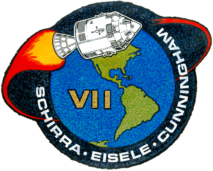
[ap07-aw1]
NASA photo S68-26668
The artwork by North American Rockwell artist Allen Stevens.
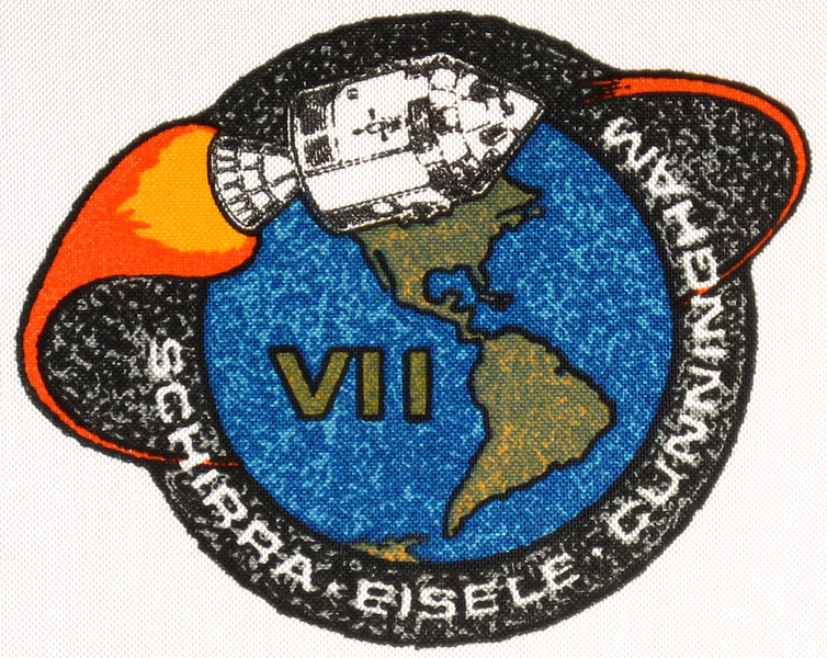
[ap07-bc1]
Beta cloth version of the Apollo 7 patch.
109mm w × 76mm h
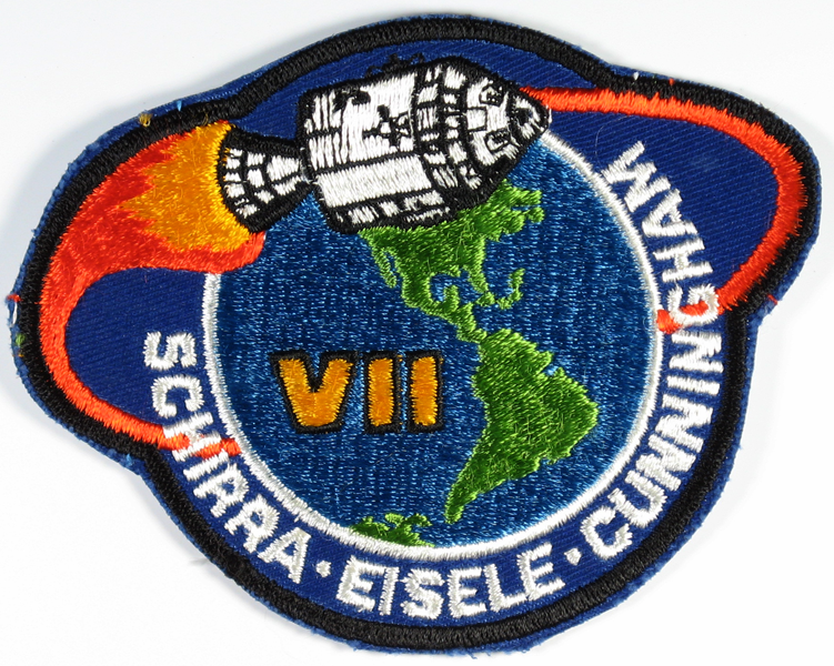
[ap07-em3]
This is the embroidered patch
that the crew wore on their post-recovery jumpsuits. The
white circular part was trimmed away prior to use. Microgramma
Bold was replaced with Eurostile in this version. Thanks
to Bill Hunt for this image.
104mm dia
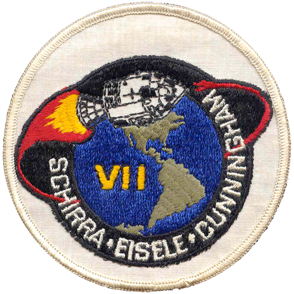
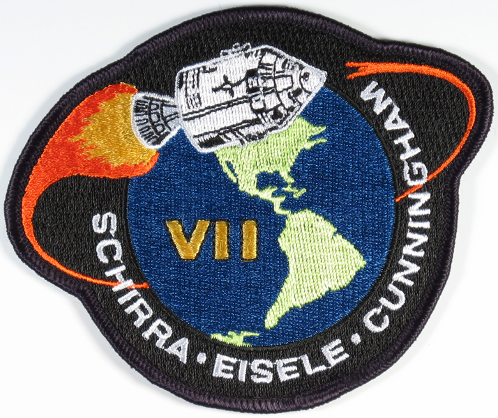
[ap07-em6]
In 2010, overwhelmed by the pervasive sight of the
incredibly ugly AB Emblem patch (see below), Apollo 7 astronaut Walt
Cunningham undertook, with the help of artist Tim Gagnon, to make a
definitive embroidered version of the Apollo 7 design. This is the result,
just about perfect.
108mm w × 81mm h
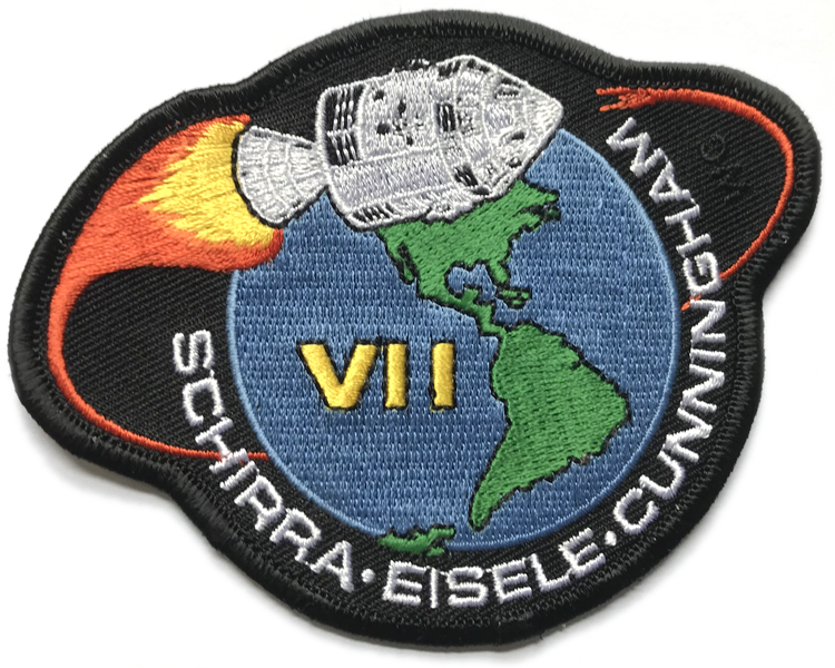
[ap07-em1]
AB Emblem embroidered Apollo 7 patch. The crew names are
not Microgramma, which seriously changes the proportions;
the exhaust trail is misshapen; and the CSM bears only a superficial
resemblance to the original. Finally, the “VII”
designation — which defines the horizontal axis — is rotated
anti-clockwise, which causes the rest of the patch to be
tilted clockwise. Sadly, this is by far the most often seen version
of the Apollo 7 patch.
117mm w × 97mm h
[ap07-em2]
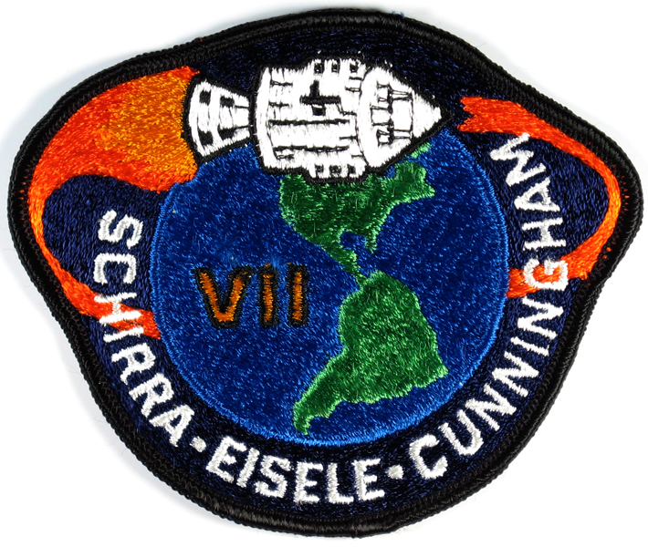
The Lion Brothers embroidered Apollo 7 patch is a
much better rendition than the AB Emblem patch. However, the lettering
is still not the correct Microgramma Bold; and a white
border has been added surrounding the Earth. There are two
variants of this patch: one has a purple background, the
other a dark blue (neither of which is correct — it should be black).
115mm w × 88mm h
[ap07-em5]
A 2006 version of the Apollo 7 patch by Randy Hunt. A
vast improvement over the previously available embroidered versions, but
overshadowed by Walt Cunningham’s authentic remake (see ap07-em6,
above).
117mm w × 95mm h

[ap07-em7]
Liem Bahneman made this very nice replica of the recovery version
(ap07-em3), complete with the enclosing white circle. The white fabric
is noticably coarser in weave than the original.
101mm dia


These proposals by artist Allen Stevens show how the concept of a CM-shaped patch evolved, a concept which culminated in the final Apollo 8 patch. Clearly, the idea of a Phoenix was seriously investigated before being dropped. The last image shows the beginning of a series that evolved into the final Apollo 7 patch. All these images are from the collection of Noah Bradley, and used with his kind permission. More images of the evolution of the Apollo 7 design can be seen in the article by Ed Hengeveld.

NASA photo S68-33744
The Apollo 7 crew pose for a portrait in the White Room.
This was taken in May 1968.

This detail from the crew portrait photo clearly shows that the patches on the crew suits at the time were neither Beta cloth nor embroidered. They were probably photograaphic reproductions of the artwork on glossy photo paper — note the reflections on Eisele’s and Cunningham’s patches. Presumably, neither embroidered nor Beta cloth patches had been produced at the time of this photo.

NASA photo KSC-68PC-211
The Apollo 7 crew aboard the USS Essex, CVS-9.

This detail from KSC-68PC-211 shows that the patch worn on the recovery jumpsuit was almost certainly ap07-em3.

